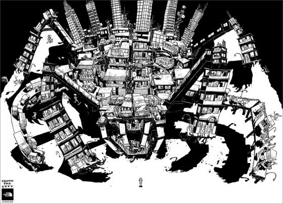
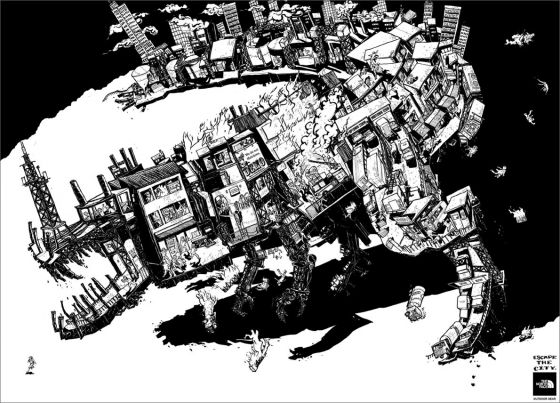
I just saw this one today for the first time and I absolutely love it. They used the contrast between black and white to the max. It kinda reminds me of good old Frank Miller comic books. It’s definitly worth clicking on the images to see them in full size, the amounth of detail is amazing.
The North Face: Escape the city5
Related Posts
Awards won (add award)
Drat! This campaign hasn’t had the honor of winning any awards yet, or maybe it just evaded our systems. Can you prove us wrong? Enlighten us by clicking here.
Leave a comment
Details
- Date: 17 October 2009
- Industry: Fashion & Clothing
- Media type: Print
Credits(add credits)
- Agency: ACE Saatchi & Saatchi, Manila
- Country:
 Philippines
Tip us
Do you have a tantalizing tip off for a hot scoop? Don’t delay, be our honorary informative and we’ll reward you!


