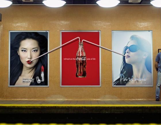
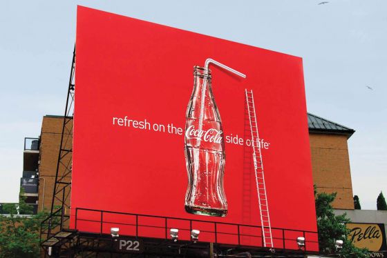
Some nice billboards designed for Coca Cola, the straws from the bottles are used in situations outside of the billboard. Can we call this ‘thinking outside the box’?
Edit: Rindert posted a similar ad back in 2009. It’s from the same agency, so probably these are new pictures of the campaign back then. Or maybe they’ve continued it with new ideas this year?


 Canada